The Limio Blog
Become truly great at subscriptions


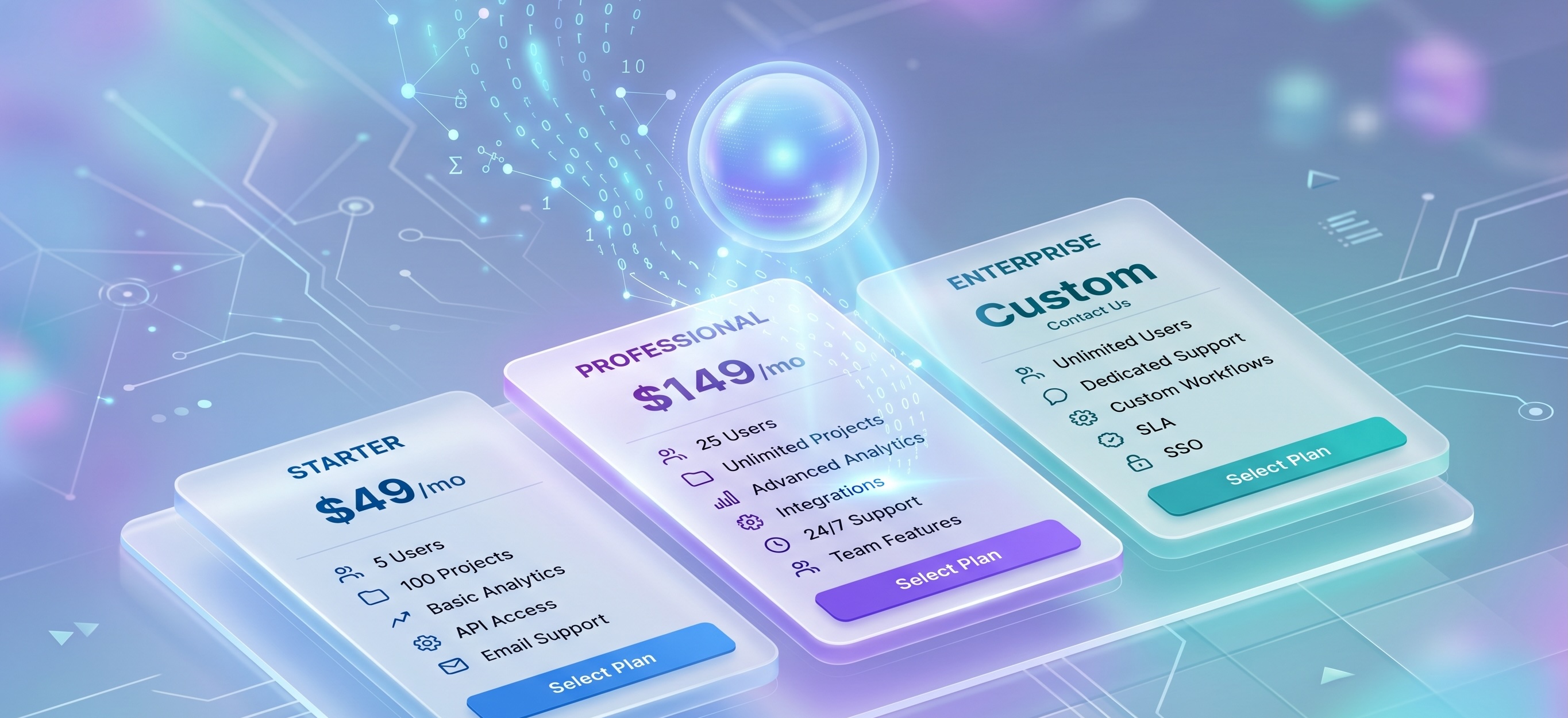
Why Every SaaS Should Have a Buy Now Button, Even If You Can't Buy Now
Almost no B2B SaaS has a buy now button, and most have good reasons. But the moment you need one - a board efficiency mandate, an entry package launch, a sales team underwater - arrives faster than the infrastructure takes to build. Here's why to build it before you need it.

Support Agents Are Everywhere. Selling Agents Aren't. Here's the Real Reason.
You've handed your support queue to an AI by now. So why does the idea of a selling agent actually taking an order still make your stomach drop? The gap isn't how smart the model is, it's the guardrails that let you trust a selling agent with money.
If an AI Agent Tried to Buy Your Subscription Today, Could It?
Everyone's talking about agents that sell for you. Almost no one's asking the simpler question: when a buyer's AI agent goes looking for your plans, can it actually find them, read them, and act? For most SaaS pricing pages today, the answer is no. Here's why and what to fix this quarter.

Why PLG Matters More Than Ever for SaaS — Especially in the Age of AI and ALG
PLG was the smart bet. AI makes it the only bet. To capture Agent-Led Growth (ALG)- your own agents selling, your customers' agents buying - you need PLG infrastructure they can plug into.
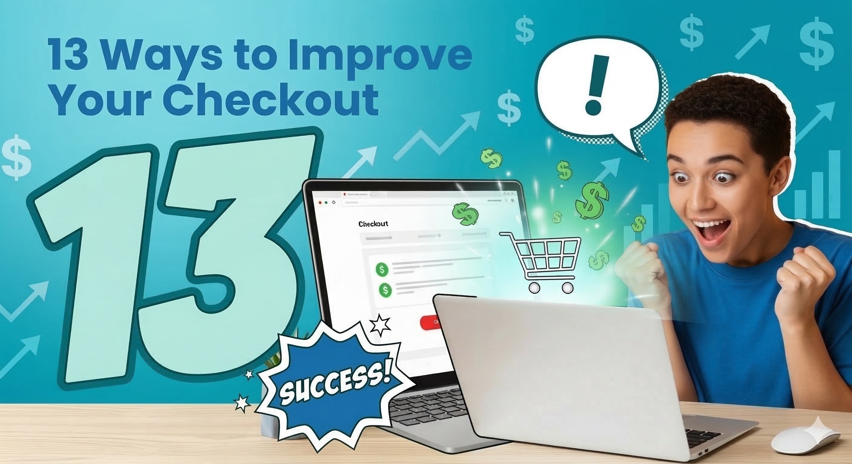
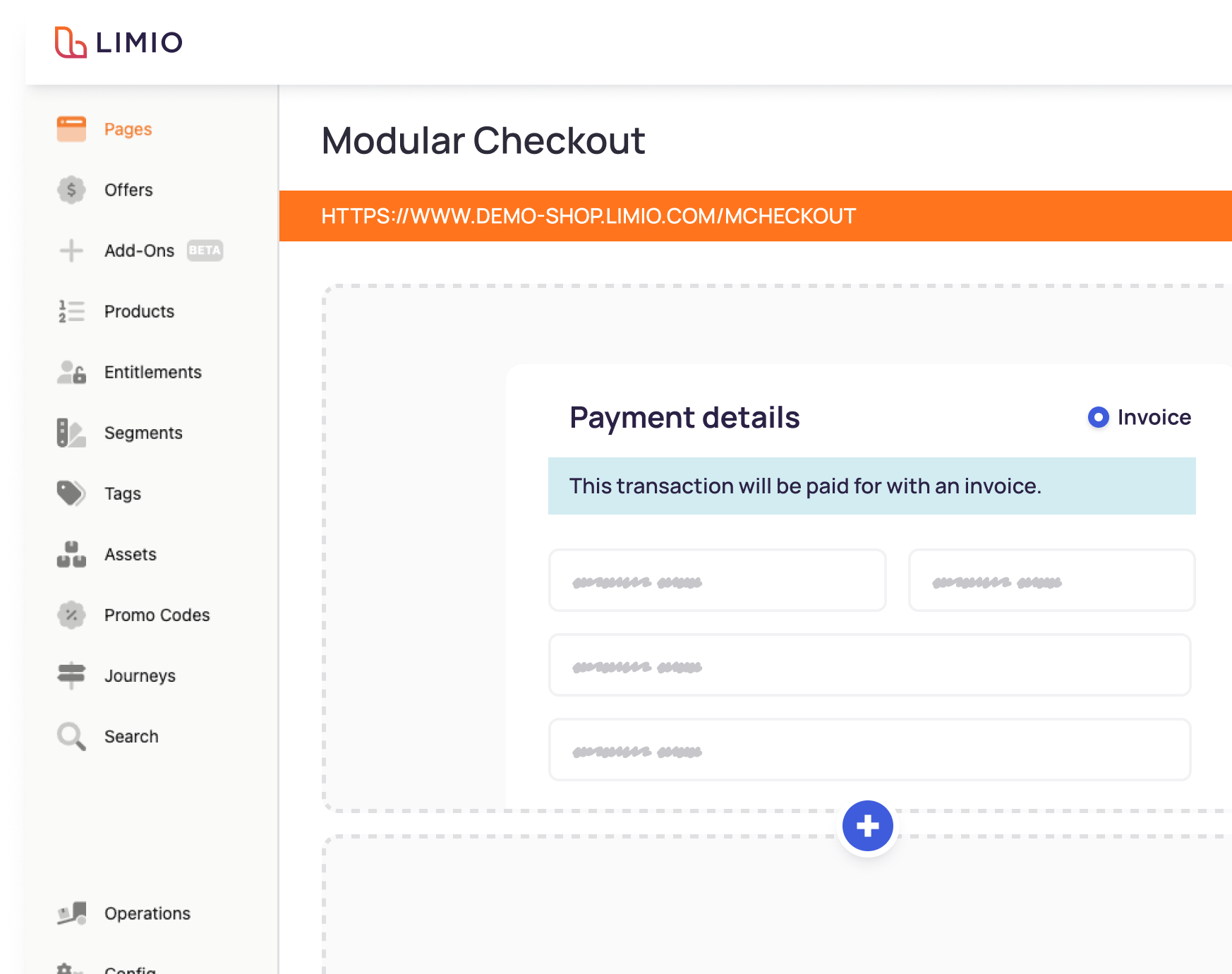
13 Ways to Improve Your Checkout in B2B SaaS
Your checkout is the most critical conversion point in your subscription business. Here are 13 proven ways to reduce friction, increase conversion, and grow revenue per cart in B2B SaaS.

Start with Stripe. Scale Your Commerce with Limio.
Stripe gets you to market. Limio helps you scale pricing, experimentation, and channel expansion as revenue complexity grows.
.png)
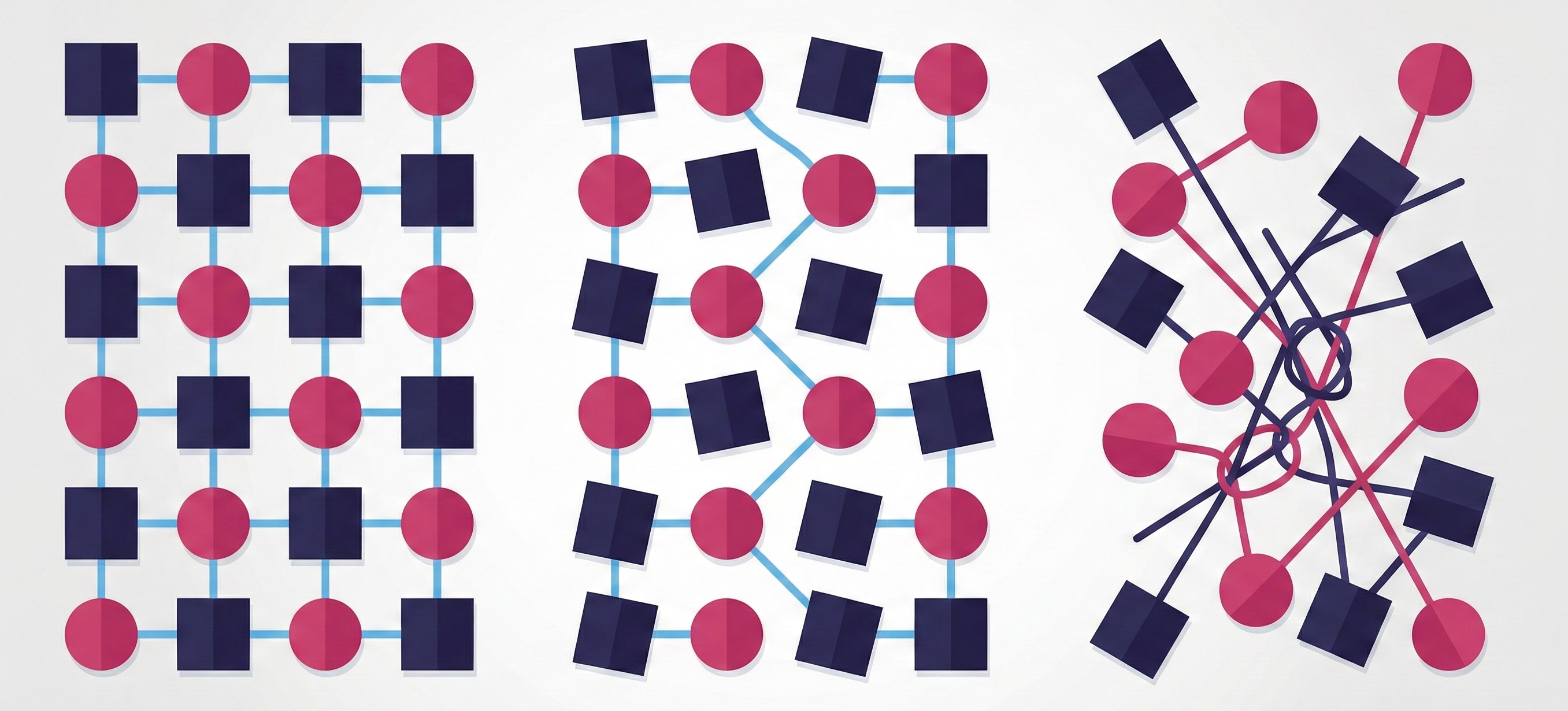
Custom-Built Commerce Is the Silent Killer of Agent-Led Growth
We inspected 50 Zuora-billing SaaS companies and found every single one runs custom-built commerce middleware between their website and their billing system. Here's why that architecture is incompatible with agent-led growth - and what to do about it.
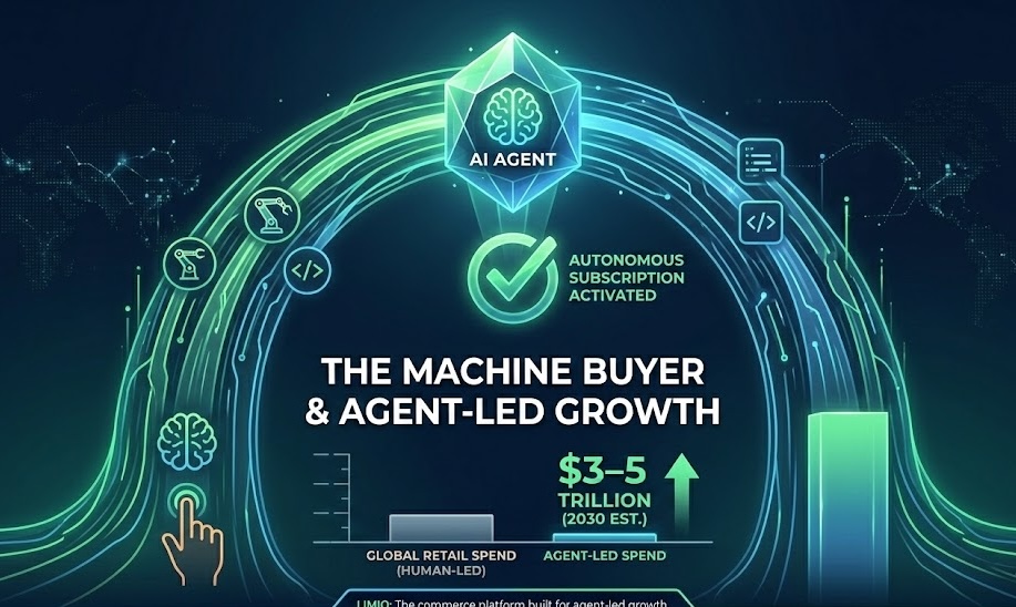
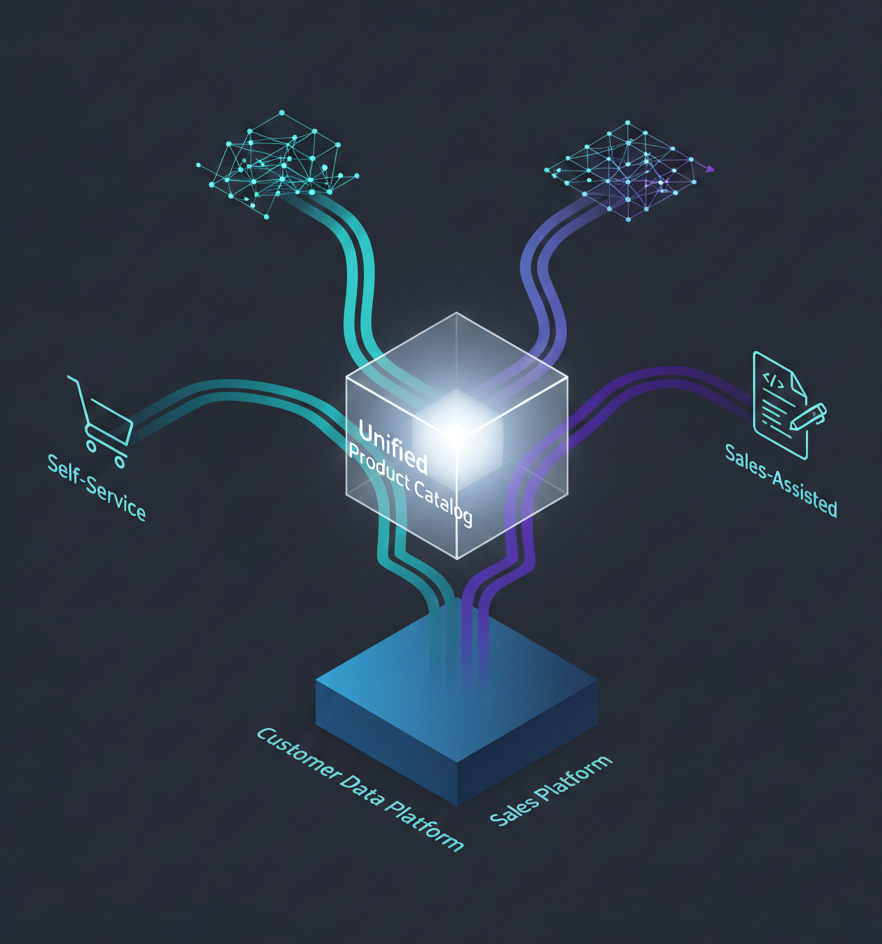
Agent-Led Growth: Why Your Next Subscriber Won't Be Human
Product-led growth redefined how SaaS companies acquire customers. Instead of gating everything behind a sales call, you let the product do the selling. It worked because it met buyers where they already were: online, researching, comparing, ready to act. Now the buyer is changing again. And this time, it might not be a person at all.
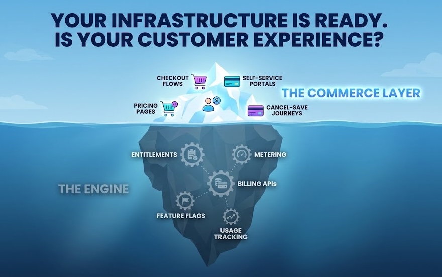
Your PLG Motion Has an Infrastructure Problem: It Needs a Commerce Layer
Most product-led growth strategies are built on strong technical foundations - entitlements, billing, and usage metering - but infrastructure alone doesn’t convert users into paying subscribers. The real driver of revenue is the commerce experience customers interact with: pricing pages, checkout flows, subscription management, and retention journeys. When that layer is missing or controlled entirely by engineering, experimentation slows and growth stalls. This article explores why PLG requires a dedicated commerce layer to truly scale.
How to Build Zuora Experiences for Commerce
Zuora handles billing. But what about the commerce experiences that actually convert visitors into subscribers? Here is what it takes to build production-ready cart, checkout, upsell, and retention flows on Zuora - and how to deploy them without building from scratch.
When PLG Meets Enterprise Sales: The Billing Stack Built for a Single Motion
Creative software companies that grew up on PLG are adding enterprise sales—and discovering their billing stack disagrees. We explore why 60% of PLG initiatives fail, and how unified commerce layers solve the hybrid motion challenge.

The Renewal Complexity Hidden in "Simple" Consumer Subscriptions
Consumer software looks simple from the outside. But when you map every way a customer might renew, upgrade, or reactivate, the complexity is staggering. We explore the twelve renewal paths that billing platforms leave manual.
.jpg)
Limio launches partner portal for scalable, self-service partner selling
Enable partners to self-provision subscriptions with confidence. Partners sell faster, RevOps stays in control, and every deal runs through the same governed commerce layer as direct and self-service channels.
Stop pricing drift before it starts: governance for RevOps
Pricing breaks gradually, not dramatically. Without strong governance, exceptions compound, systems fall out of sync, and pricing becomes harder to scale. This piece explains how RevOps can enforce clarity and keep pricing clean.
What Omnichannel Means for the New RevOps Stack
Omnichannel isn’t about adding more ways to sell. It’s about aligning catalog, pricing, quoting, and entitlements across every channel so revenue can flow without friction. This piece breaks down why legacy RevOps stacks fail - and what a unified architecture looks like.

Limio achieves SOC 2 Type II compliance - another milestone for secure omnichannel commerce
Limio has secured SOC 2 Type II compliance, reinforcing our commitment to data security and making procurement easier for enterprise and regulated customers.

How should AI startups think about pricing? Spoiler: base, credits, and add-ons
AI products break the old subscription model, yet the best pricing strategies follow timeless principles. Successful AI companies blend a base plan with credits and add-ons to balance predictability with flexibility. The real challenge is not choosing between subscription and usage, but designing a system that feels simple even when value depends on consumption. This post explores why hybrid pricing works, why it is hard to operationalise, and how clarity can become a competitive advantage. What is the right way to structure pricing as you scale?
Limio launches Limio Omnichannel CPQ for Salesforce
Limio is introducing at Agentforce World Tour London our newest Salesforce extension, Limio Omnichannel CPQ for Salesforce, a unified Configure-Price-Quote platform that connects sales-led, online, and self-service selling motions.
Subscription playbook: What Revenue Teams Forget Between Sign-Up and Renewal
Most of the revenue in subscription businesses is created after the customer signs up, not at the moment of acquisition. But rigid systems, hard-coded offers, and slow pricing updates mean upgrades, renewals, and expansions often lag behind what the market demands. As marketing experiments weekly, monetisation experiments might only happen once a quarter. Over time, pricing becomes inconsistent, quoting becomes messy, and revenue becomes unpredictable.Limio helps teams break this cycle by centralising offers across every channel and allowing rapid changes without engineering support. Pricing stays aligned, experiments run quickly, and revenue becomes a continuous, data driven loop rather than a one time event.

Designing promotions that work across PLG, CPQ, and partner flows
Most promotions fail because each system applies its own interpretation of the same offer. Online checkouts, CRM workflows, CPQ logic, and partner portals all drift apart, leaving customers confused and revenue teams cleaning up inconsistencies. Limio solves this by centralising offer and promotion logic across every channel. RevOps defines eligibility, discount rules, attribution, and expiry once, then publishes everywhere instantly. Marketing moves faster, sales stays accurate, partners stay aligned, and finance avoids hidden costs. When every touchpoint draws from the same source of truth, promotions become reliable, repeatable, and ready for continuous experimentation.
Understanding Abandoned Cart Emails in the UK: Three Options and the Rules Behind Them
Recovering abandoned baskets is essential for subscription ecommerce performance, but not all abandoned cart emails are treated the same under UK privacy law. Our in depth guide explains the three compliant approaches you can take: sending a pure service based reminder, using the soft opt in to deliver promotional incentives or relying on explicit consent for marketing focused messages. If you want to maximise recovery while staying firmly within UK PECR requirements, you’ll find a clear framework here — and with Limio, you can put it into practice without complexity.
How (and Why) Fast-Growing SaaS Companies Evolve Their Pricing Every Quarter
Pricing is not a one-off task but an ongoing discipline. In fast-moving SaaS markets, static pricing quickly slows growth. The best SaaS teams treat pricing as an operating rhythm, not a special project. They review and adjust every quarter to reflect shifts in product, segment, and competition. Without this agility, companies risk undercharging power users, overcharging small customers, and turning every commercial update into an engineering project. Modern SaaS leaders avoid this trap by empowering business teams to make pricing changes directly and measure results rapidly. With Limio, pricing updates are instant, coordinated across every channel, and integrated with CRM and billing systems.
.svg)
Add-Ons, Bundles, and Upgrades: The Real Drivers of SaaS ARPU
Most SaaS teams focus on acquiring new customers, but real growth often comes from the ones you already have. Expansion through bundles, add-ons, and upgrades can quickly lift average revenue per user, yet many teams still manage these manually and inconsistently. With Limio, product and marketing teams can launch, test, and refine offers in minutes, keeping pricing synced across CRM and billing systems. The result is faster growth, higher ARPU, and a scalable expansion motion that runs without developer bottlenecks.

How to Roll Out a New Price Without Breaking Everything
Launching a new pricing should feel like progress, not panic. Yet for many SaaS teams, one tweak to pricing or a packaging can trigger chaos across CRM, finance, self-service, and sales systems. This blog explores why price & packaging changes so often grind to a halt and how fast-moving teams turn them into a smooth, one-day process. Learn how to centralise control, preview safely, and move fast without breaking everything - and see how Limio helps make it effortless.

Stop Losing Money on Small Deals: The Quote-to-Checkout Fix
Manual sales processes for small deals are killing your efficiency. When reps spend hours closing $500 contracts, you're bleeding margin and missing bigger opportunities. Learn how quote-to-checkout automation helps companies like Box capture 20% of ARR through self-serve - while freeing sales teams to focus on enterprise deals.
Why SaaS Tiered Pricing Still Works, and Where It Doesn’t
Tiered pricing has long been the go-to model for SaaS companies, offering clear choices like “Basic,” “Pro,” and “Enterprise” that customers instantly understand. It’s simple, scalable, and effective - until it isn’t. As products become more complex and customers demand flexibility, rigid tiers can start to feel limiting. This article explores where tiered pricing still shines, where it breaks down, and how modern SaaS businesses are evolving their models to stay aligned with customer needs. With Limio, you can make that evolution effortless, testing and adapting pricing without code or disruption.
.jpg)
Why Most SaaS Renewal Experiences Still Feel Broken
In subscription businesses, acquisition gets all the attention. Launch campaigns, free trials, and signups are celebrated. But when it comes time for customers to renew, the experience is often neglected. Instead of reinforcing trust and value, renewals often feel clunky: emails get lost, sales reps chase down signatures, or customers are left unsure what price they will pay, upsell opportunities are lost. What should be a seamless moment becomes a source of friction.

RevOps at Scale: Connecting PLG, Sales, and Partners in One Flow
In SaaS, revenue growth depends on multiple channels — product-led, sales-led, and partner-led — yet most companies manage each in isolation. This fragmentation forces RevOps teams to juggle disconnected tools like Salesforce, Zuora, and partner portals, slowing growth and creating friction for customers. A connected RevOps model changes that. By unifying offers, quotes, and orders across all channels, companies can deliver consistent pricing, seamless buying experiences, and real-time data synchronisation. The result is fewer leaks, faster revenue cycles, and RevOps teams that focus on scaling rather than fixing broken processes.

Why Partner Portals Matter in Subscription Growth
Subscription businesses often invest heavily in direct sales and self-service channels, while overlooking their partner channel. Yet resellers and distributors can make or break growth. A modern partner portal isn’t just a “nice to have”, it is key enabler for scaling recurring revenue.
Can you run PLG on Stripe Billing as a scale-up?
As a scale-up, you may be asking whether Stripe Billing can support product led growth, enterprise sales, and partner channels all at once. The answer is sometimes, but not without friction. Stripe Billing is excellent at payments and subscriptions, yet when you push beyond simple self service, the gaps show up quickly.

The Silent Killer of Retention: Broken Self-Service Journeys
Customers expect to manage subscriptions as easily as they buy them. But for many subscription businesses, self-service journeys break down.. forcing customers into support queues and driving silent churn. This post unpacks why self-service is so critical, what typically goes wrong, and how Limio helps teams deliver seamless subscription management on top of Salesforce and Zuora.
The 6-Month Checkout Problem: Why Subscription Flows Take Forever to Launch
Many subscription businesses find themselves waiting months to launch even a simple checkout flow. It’s not a limitation of Zuora or Salesforce; it’s the bottleneck of custom engineering, cross-team dependencies, and compliance hurdles. This delay stalls growth, kills experiments, and ties up valuable dev time. Limio provides a no-code commerce layer that works with Salesforce and Zuora to cut timelines from months to weeks, so teams can launch offers at market speed.
Integrating Shopify with Zuora: Not So Easy
At first glance, pairing Shopify’s ecommerce power with Zuora’s subscription management seems like the perfect match. Businesses imagine a seamless combination that delivers world-class checkout and robust billing all in one. The reality, however, is anything but simple. Integrating Shopify with Zuora quickly exposes deep differences in their data models, payment handling, and subscription lifecycles. Add to this the need for middleware platforms, and the result is a complex, costly integration effort that often leads companies to question whether the trade-offs are worth it.

Choosing the Right CPQ for Salesforce with Stripe Billing
Finding the right CPQ for Salesforce that works seamlessly with Stripe Billing is harder than it looks. Most vendors either push their own billing engine or add extra layers of complexity. Limio for Salesforce takes a different approach. Built natively on Lightning Flow and Lightning Web Components, Limio lets Salesforce admins manage quoting directly in Salesforce while keeping Stripe Billing as the source of truth. No rip & replace, no duplicate catalogues, just Salesforce-native CPQ integrated with Stripe and ready for omnichannel subscription commerce and PLG.
.png)
Zuora Subscriber Portal in Maintenance Mode: What Now?
Zuora’s legacy Subscriber Portal is now in maintenance mode, leaving subscription businesses with a critical question: how do you continue delivering seamless self-service to your customers? Basic features like viewing invoices or updating payment methods may still work, but the lack of innovation and flexibility creates friction, drives up support costs, and risks churn. That’s where Limio comes in, offering a modern, branded, and fully integrated alternative that not only replaces the Zuora portal but also unlocks product-led growth and Salesforce-powered efficiency.

Salesforce + Zuora ≠ Subscription Experience
Salesforce and Zuora are the backbone of subscription businesses — but they don’t deliver the experience your customers actually see. Clunky checkouts, missing self-service, and slow rollouts leave gaps that cost you revenue. Discover why Salesforce + Zuora ≠ Subscription Experience, and what you need to bridge the gap.
.jpg)
SaaS Renewals Made Easy: Automating Retention and Upsell with Self Service
Renewals are the lifeblood of any SaaS business. But too often, the process is manual, time-consuming, and frustrating for both customers and sales teams. A renewal portal with self service changes that story — making renewals seamless for customers, freeing up sales capacity, and giving companies a better chance to retain and grow their accounts.

Customer Billing Portal for SaaS: Unlocking Cash Flow and Efficiency with Financial Self Service
Late payments, manual invoice chasing, and bad debt are headaches every SaaS finance team knows too well. For a $20m ARR company, these issues can tie up millions in cash flow and waste valuable resources. A customer portal with financial self service turns this problem into an opportunity: customers pay on their own terms, finance teams spend less time on collections, and CFOs gain the predictability they need.

The SaaS Commerce Shift: Insights from GitLab, Zoom, and Box
SaaS companies are no longer just building products, they are building commerce engines. Much like retailers or media giants, leading SaaS firms such as GitLab, Zoom, and Box are investing heavily in teams, platforms, and processes dedicated to how they sell, bill, and monetise. These aren’t just billing departments, they are cross-functional commerce layers that shape customer acquisition, enable omnichannel selling, and drive revenue growth at scale. In this article, we explore how these three companies are redefining SaaS commerce, and why building an omnichannel commerce layer is fast becoming a competitive necessity.
Commerce Infrastructure: The Missing Piece in the SaaS Growth Stack
The SaaS landscape has transformed dramatically over the past decade. What began as simple subscription models with standard pricing tiers and single sales motion has evolved into a complex ecosystem of hybrid pricing and go-to-market strategies that demand entirely new approaches to monetization. Yet many companies are still relying on billing infrastructure designed for a simpler era.

13 Reasons Not to Build Your Own Commerce Infrastructure (Buy It Instead!)
Thinking of building your own subscription commerce infrastructure?
We get it. You’ve got a sharp team, a long backlog, and a dream of total control. But before you unleash your engineers on yet another internal tool that will quietly become everyone’s problem in 12 months, let us save you the pain. At Limio, we’ve seen the movie (and the sequel, and the reboot). We help SaaS companies monetise across product-led, sales-led, and partner-led channels — and we’ve met plenty of brave souls who tried to build it all themselves. This blog is our tongue-in-cheek but painfully real guide to why that path often leads to delays, hidden costs, and late-night Slack meltdowns. Here are 13 reasons why building your own commerce stack might not be the genius move it seems — and why buying one might just save your roadmap, your budget, and your sanity.

Omnichannel CPQ: The Next Frontier for High‑Velocity SaaS Sales
SaaS buyers don’t stick to one channel—and your quoting process shouldn’t either. Whether it starts with a sales rep, an online checkout, or a partner, today’s Revenue Ops teams need quoting that flows across every touchpoint. This post breaks down what omnichannel CPQ really means, why it matters now, and how to avoid the usual traps like billing lock-in, slow rollouts, and disconnected systems. If you’re selling to SMBs or freelancers with hybrid go-to-market motions, and struggling to keep pricing consistent across Salesforce and your storefront, this is your guide to doing CPQ the modern way.

Reseller Portal for Zuora & Salesforce: Empowering Your Partner Sales Channel
As subscription businesses expand through indirect sales, RevOps teams are increasingly tasked with enabling seamless order-to-cash processes for resellers and partners. A Zuora-integrated reseller portal plays a critical role in this strategy, allowing partners to process orders, manage subscriptions, and support customer lifecycle events like upgrades and cancellations - all while maintaining billing accuracy and CRM visibility. This post explores how Limio’s reseller partner portal provides deep Zuora and Salesforce integration, omnichannel commerce support, and advanced analytics to empower indirect channels and accelerate partner-driven growth.

The Most Powerful Native PLG Tool for Zuora
Product-led growth (PLG) is transforming how companies sell subscriptions, but for Zuora users, adopting PLG often means heavy engineering, custom integrations, and slow execution. Limio changes that. As the most powerful native PLG tool for Zuora, Limio lets you launch trials, convert users to paid plans, and enable self-service – all without writing code or building integrations. In this post, we’ll explore how Limio helps Zuora customers go live faster, experiment freely, and scale PLG with minimal effort.

The critical role of partner sales channels in B2B SaaS: Why resellers matter for SME-focused platforms
In today’s SaaS landscape, especially for platforms targeting small and medium-sized enterprises (SMEs), developing a strong partner sales channel is no longer optional – it's a strategic imperative. As market competition intensifies and customer acquisition costs rise, the partner sales channel offers an effective, scalable, and cost-efficient way to grow revenue, penetrate new markets, and drive product adoption.
.jpg)
Which platforms allow you to unify sales-assisted and product-led growth (PLG) motions?
Modern businesses often need to support sales-assisted deals (via sales reps and CRM) and product-led growth (via self-serve web purchases). Achieving this means integrating your Salesforce CRM with e-commerce/self-service capabilities like Limio, CPQ tools, and a backend billing system. Let's dive in the options.

6 platforms you could integrate with Zuora for subscription ecommerce
Below, we’ll look at five great options for subscription ecommerce and how they can help you.

Looking for a Keylight alternative? Limio provides the support you deserve
At Limio, we offer a modern, customer-first approach to subscription commerce. Our platform is designed to support your business growth, with a strong focus on responsiveness, features that put you in control, and a long-term roadmap with Zuora.

Why you should let your subscribers cancel online and how to do it right
We expect to see even more scrutiny in the subscription sector, with a heavy focus on cancellation processes. This article will detail how your business can stay ahead of any impending regulations by offering simple online cancellations.

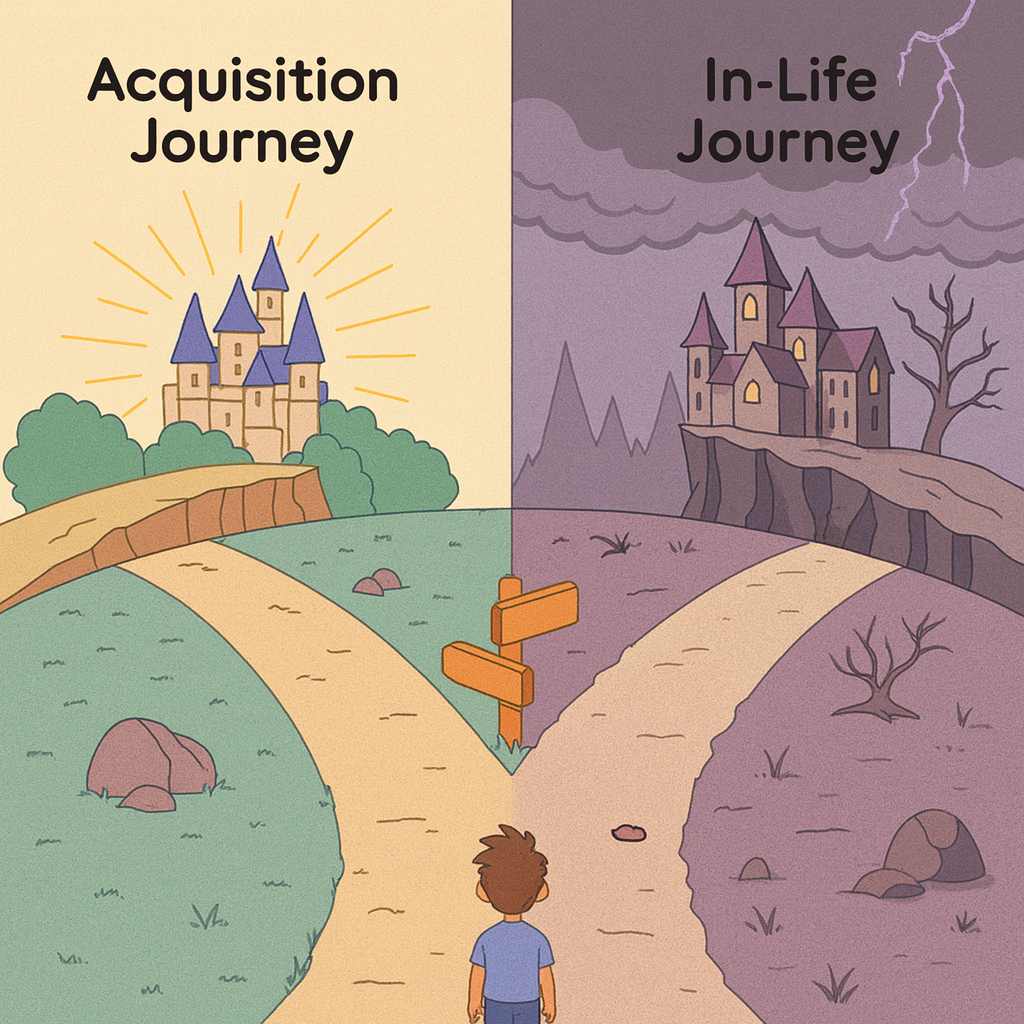
Mastering the customer acquisition journey for your subscription business

What are the key KPIs for a great checkout?
However, with 57.9% of carts being abandoned in the UK and 68.7% in the US, it’s clear that businesses need to do more to prevent cart abandonment in the first place. Picking the right KPIs to keep track of is a great way to kickstart a data-driven overhaul of your checkout.

How to navigate subscription regulations from around the world
Times are hard for everyone right now, so customers looking to cancel their subscriptions aren’t always unhappy with their service. So, as long as they can cancel or alter their subscription with no fuss, there’s a strong chance they’ll return once their situation improves.

Everything you need to know about Zuora
There are plenty of platforms available, with various plans and features to choose from. From leaders such as Zuora, Stripe Billing, Recurly, Chargebee, BillingPlatform, Vindicia, to more geographically-focussed or industry-focussed such as Plenigo, Billwerk+, Qiota, Poole, Aptitude Software and more, it can be daunting to pick the right parter.

Three examples of subscription acquisition campaigns by Spotify, Drover and Sky
Everything you need to know about Chargebee
To make it easier for you, we’re exploring some of the top platforms and what they offer. We’ve already looked at Zuora and Stripe Billing in detail. Now, we’ll check out Chargebee, especially Chargebee’s billing and subscription management features.

Everything you need to know about BillingPlatform
Keep reading for the lowdown on this subscription billing platform, including the main features, pricing, and more.

Why we launched an analytics product
We’ll look at six of our favourites in this post and explain why we like them. But first, let’s...

6 SaaS pricing pages we love and why they work
We’ll look at six of our favourites in this post and explain why we like them. But first, let’s...